MaterialTimePicker as an upgrade of the TimePickerDialog
On 4th Feb 2021 Google’s team has released a new stable version of the Material Components library with a new time picker called MaterialTimePicker. This article is a brief explanation of what exactly has changed in design and functionality.
Readme documentation: material-components-android/TimePicker.md at master · material-components/material-components-android (github.com)
Material design documentation: Time pickers — Material Design
Changes in UI/UX
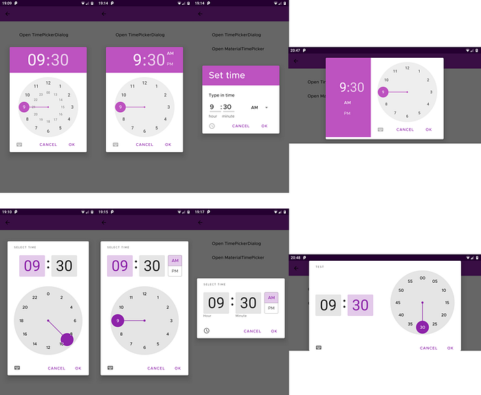
Below you can compare the overall appearance of time pickers:
TimePickerDialog (on top) vs MaterialTimePicker (at the bottom)

I’ve noticed the following major updates in UI/UX in regards to the TimePickerDialog:
- You can now specify the title of a popup by invoking the setTitleText(int) or setTitleText(CharSequence) methods. The title is readable by screen readers so setting one of these methods improves the accessibility of your application. You can read more about accessibility here or here.
- (in case of 24h time format) You can select an hour directly from 0 to 23 in one level clock dial
- You can now select the input mode by default (mode after clicking the keyboard icon) by setting the setInputMode method to INPUT_MODE_KEYBOARD
- Double-clicking on the hour/minutes display puts the time picker into input mode
- Various theming options (described in a separate section)
Changes in implementation
To use MaterialTimePicker you need to have at least 1.3.0-alpha02 or 1.3.0 version of material components library.
implementation 'com.google.android.material:material:1.3.0'Now You can declare and show our MaterialTimePicker, e.g:
In comparison to TimePickerDialog which we can implement for example that:
You can notice that MaterialTimePicker requires FragmentManager to show the dialog. This is because MaterialTimePicker extends DialogFragment, but in contrast, TimePickerDialog extends Dialog.
Theming MaterialTimePicker
Here are some facts about MaterialTimePicker:
- Default style:
Widget.MaterialComponents.TimePicker - Default style theme attribute:
?attr/materialTimePickerStyle - It supports Material Theming
- MaterialTimePicker appearance may be changed in various ways for example:

Here is the snippet for this theming:
Unfortunately, I’ve also tried to change the picker styling, but it looks like something doesn’t work. 🤷♂️ I’ve used the material components library in version 1.3.0.
You should be able to modify your MaterialTimePicker with these attributes:
- app:keyboardIcon
- app:clockIcon
- app:clockFaceBackgroundColor
- app:clockNumberTextColor
- app:clockNumberTextColor
I can fully recommend switching to the new MaterialTimePicker because of, among other things, more options of picker customization and to match the new Material Design. I know that these aren’t major changes but also the cost of switching to a new picker is small, so in my opinion, it is worth the effort of switching.
